
Iris and Trees - How do decision trees do it?
Preface
This post presents concepts about how Decision Trees (DT) algorithm works. To elaborate it, I’m going to use the Iris dataset and the R language, using the dplyr grammar.
library(tidyverse)
library(magrittr)
library(knitr)
library(GGally)
library(rpart)
library(rattle)
library(rpart.utils)
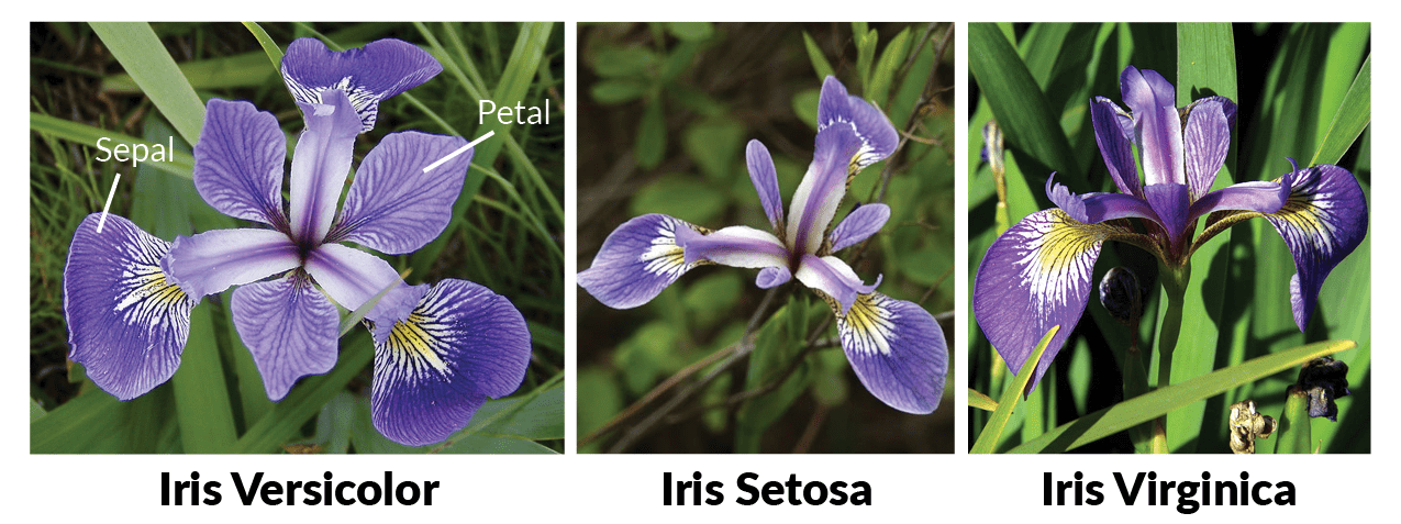
iris <- iris %>% as_tibble()The Iris dataset is formed by the measurements of width and height from petals and sepals of three kinds of Iris flower. The flowers are shown bellow:
The dataset has 150 samples on total, 50 observations by specie.
iris %>% head()## # A tibble: 6 x 5
## Sepal.Length Sepal.Width Petal.Length Petal.Width Species
## <dbl> <dbl> <dbl> <dbl> <fct>
## 1 5.1 3.5 1.4 0.2 setosa
## 2 4.9 3 1.4 0.2 setosa
## 3 4.7 3.2 1.3 0.2 setosa
## 4 4.6 3.1 1.5 0.2 setosa
## 5 5 3.6 1.4 0.2 setosa
## 6 5.4 3.9 1.7 0.4 setosaIn this post, I want to model a decision tree to solve the detection of the Iris species. Here, I intend to show the main steps used to find tree algorithm convergence .
Looking at the Data
Before modeling, let’s do the homework and split the data into training and testing sets.
set.seed(654)

train_idx <- sample(nrow(iris), 0.75*nrow(iris))

train <- iris %>% slice(train_idx)
test <- iris %>% slice(-train_idx)
The dataset contains four predictors, how are they correlate? Is it possible that the Iris classes have a clear separation in a 2D view of the variables ?
train %>%
        ggpairs(aes(colour=Species), columns=1:4, lower="blank",
                diag="blank", upper=list(continuous="points")) +
theme_bw() 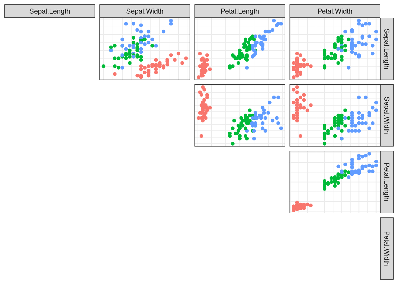
Yes, there is a high correlation between Petal.Length and Petal.Width. Also there’s a clear separation between the species along the values of the petals measurements.
Machine Learning
This discriminative model try to split the Predictor Space \(\Large{X}\) in subspaces that maximize the gain of the data classification. Decision trees are a non-linear mapping function.
\[ \Large{\mathcal{F}} : X \rightarrow Y \]
What decision trees are about?
- It’s a non-parametric and non-linear method.
- It attacks the predictor space doing stratification and segmentation.
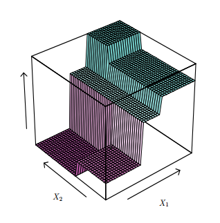
The tree has a top-down approach, the upper node is called Root. The inner nodes are branches, and the terminal nodes are leaves. Each leaf represents a subspace of the predictor space. See a generic DT graph below, which uses only two predictors.
tree_fit <- rpart("Species ~ Petal.Length + Petal.Width", train,
                  control=rpart.control(cp=0, minbucket=1))

fancyRpartPlot(tree_fit, sub="")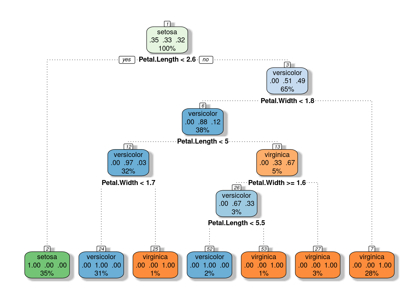
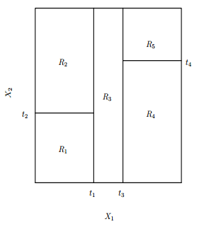
Decision Regions
The figure below is a representation of the 2D segmented predictor space. Each microregion is a leaf.
splits <- tree_fit %>%
                rpart.subrules.table() %>%
                as_tibble() %>%
                select(Variable, Less) %>%
                filter(!is.na(Less)) %>%
                mutate(Less=as.numeric(as.character(Less)))

splits_len <- splits %>%
                filter(Variable == "Petal.Length") %>%
                pull(Less)

splits_wid <- splits %>%
                filter(Variable == "Petal.Width") %>%
                pull(Less)

x_axis <- with(train, range(Petal.Length))
y_axis <- with(train, range(Petal.Width))

n_points <- train %>% nrow()

train %>% ggplot(aes(x=Petal.Length, y=Petal.Width, colour=Species)) +
            geom_point() + theme_bw() + scale_x_continuous(breaks=seq(10,1)) +
            geom_line(aes(x=rep(splits_len[1], n_points), y=seq(y_axis[1], y_axis[2], length.out=n_points)), colour="black") +
            geom_line(aes(x=seq(splits_len[2], x_axis[2], length.out=n_points), y=rep(splits_wid[1], n_points)), colour="black") +
            geom_line(aes(x=rep(splits_len[2], n_points), y=seq(y_axis[1], y_axis[2], length.out=n_points)), colour="black") +
            geom_line(aes(x=seq(splits_len[2], x_axis[2], length.out=n_points), y=rep(splits_wid[1], n_points)), colour="black") +
            geom_line(aes(x=rep(splits_len[3], n_points), y=seq(y_axis[1], splits_wid[1], length.out=n_points)), colour="black") +
            geom_line(aes(x=seq(splits_len[3], x_axis[2], length.out=n_points), y=rep(splits_wid[2], n_points)), colour="black")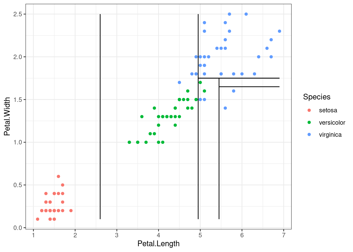
Now, getting examples from a generic model, we see a 2D predictor space represented in depth to elucidate the stratification stage. Each level is a depth level of the tree.
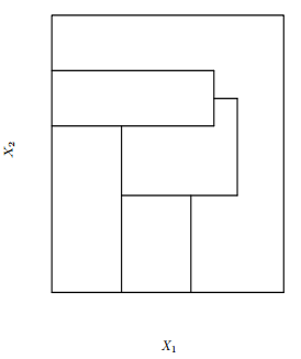
An important detail is about what a DT doesn’t do, as the kind of segmentation bellow.
How to build the tree ?
– Main idea:
- Choose a predictor \(A\) and a threshold value \(t\), based on an objective function, as the split point of the root.
- Divide the trainset \(S\) into subsets \({S_1, S_2, ..., S_k}\), each subset must contain only samples from the same value of decision chosen at 1.
- Recursively, apply the steps 1 and 2 for each new subset \(S_i\), creating new branches under the root, until all nodes have only elements of the same class.
How to choose the best predictor to split a tree node??
Error rate? -> it doesn’t coverge well, it’s not sensitive to the tree growth.
Gini index -> impurity measurement of the node.
\[G({s_i}) = \sum_{k=1}^{K}{\hat{p}_{{s_i}k}(1-\hat{p}_{{s_i}k})}\]
- Entropy -> Quantity of disorder, and by the concept from information theory, it’s the quantity of bits needed to store the information.
\[E({s_i}) = -\sum_{k=1}^K{\hat{p}_{{s_i}k}\log{{\hat{p}}_{{s_i}k}}}\]
Let’s check these functions behavior along possible probabilities distributions of the classes in the node:
compute_gini_by_prob_dist <- function(prob) {
            prob*(1 - prob) + (1 - prob)*(1 - (1 - prob))
}

compute_entropy_by_prob <- function(prob) {
    - prob * log(prob, base=2)
}

compute_entropy_by_prob_dist <- function(prob) {
            if (prob %in% c(0,1)) {
                0
            } else {
                compute_entropy_by_prob(prob) + compute_entropy_by_prob(1 - prob)
            }
}

df_probs_results <- tibble(probs=seq(0, 1, length.out=100)) %>%
                        mutate(y_gini=map_dbl(probs, compute_gini_by_prob_dist)) %>%
                        mutate(y_entr=map_dbl(probs, compute_entropy_by_prob_dist))

df_probs_results %>%
    ggplot(aes(x=probs)) +
        geom_line(aes(y=y_gini, colour="Gini")) +
        geom_line(aes(y=y_entr, colour="Entropia")) +
        theme_bw()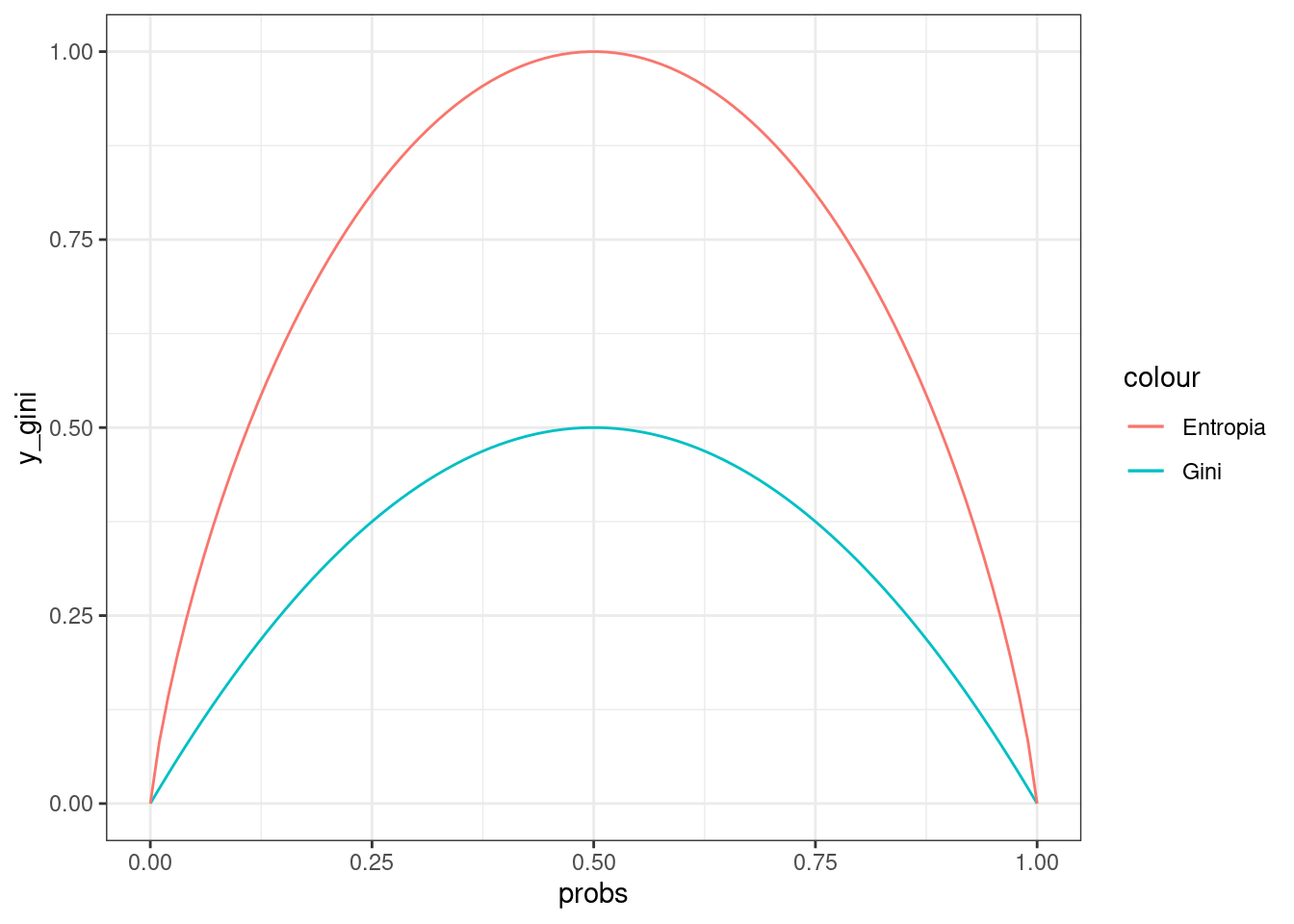
Example of split decision using entropy.
To simplify the example, we keep the predictor space with only two features: Petal Length e Petal Width.
1. Measuring entropy of the root node:
The predictor space shown bellow is the root node, named \(S_1\).
S1 <- train %>%
        select(Petal.Length, Petal.Width, Species)

S1 %>%
    ggplot(aes(x=Petal.Length, Petal.Width)) +
        geom_point(aes(colour=Species)) +
        theme_bw()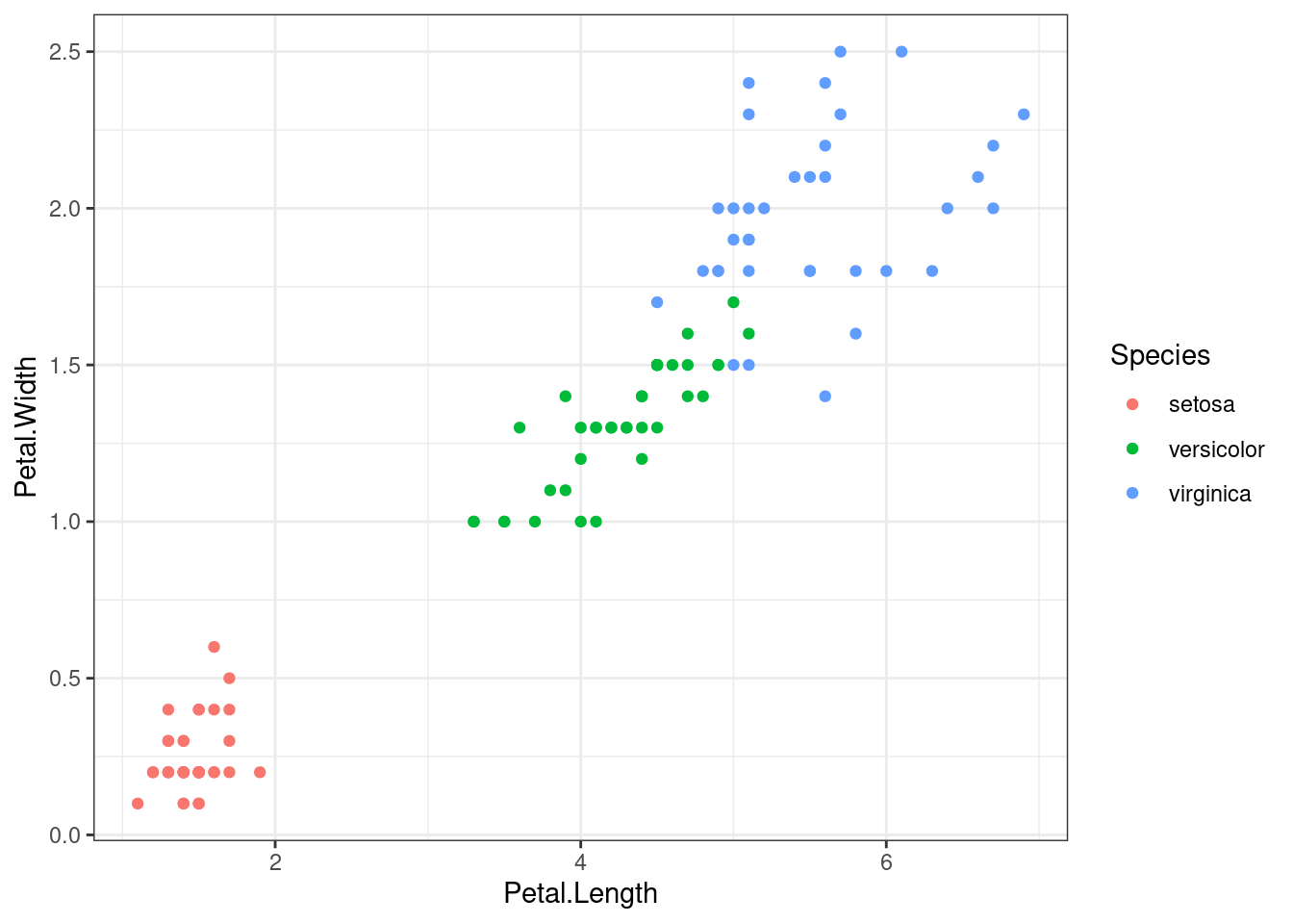
To start entropy computation, firstly the prior probability it is needed from each class.
\[E({s_i}) = -\sum_{k=1}^K{\hat{p}_{{s_i}k}\log{{\hat{p}}_{{s_i}k}}}\]
S1 %>%
    group_by(Species) %>%
    summarise(qtd=n()) %>%
    mutate(prob=qtd/sum(qtd)) %>%
    mutate(prob=round(prob, 3))
## # A tibble: 3 x 3
## Species qtd prob
## <fct> <int> <dbl>
## 1 setosa 39 0.348
## 2 versicolor 37 0.33
## 3 virginica 36 0.321Now, the summation:
entropy_S1 <- - (0.339 * log(0.339, base=2) + 0.339 * log(0.339, base=2) + 0.321 * log(0.321, base=2))

print(entropy_S1)
## [1] 1.584349
2. Splitting criteria:
To decide where to split, the Information Gain is used concept, that’s the entropy difference between the parent node and the siblings node.
\[\Delta{E} = p(S_{1})E(S_{1}) - \Big[p(S_{11})E(S_{11}) + p(S_{12})E(S_{12})\Big]\]
In this case, we have two continuos variables. For each variable, all values between the range domain are checked as a possible splitting point. The variable which presents the best gain information is the chosen one.
compute_entropy <- function(S) {
        if (nrow(S) == 0) {
                return(0)
        }

        list_probs <- S %>%
                        group_by(Species) %>%
                        summarise(qtd=n()) %>%
                        mutate(prob=qtd/sum(qtd)) %>%
                        pull(prob)

        entropy <- list_probs %>%
                        map_dbl(compute_entropy_by_prob) %>%
                        sum()

        return(entropy)
}


entropy_S1 <- compute_entropy(S1)

df_entropy_gains <- tibble(feature=character(),
                           threshold=numeric(),
                           info_gain=numeric())

for (feat in c("Petal.Length", "Petal.Width")) {
        range <- S1 %>%
                   select(!!feat) %>%
                   range()

        for (i in seq(range[1], range[2], 0.01)) {
                S1_1 <- S1 %>%
                            filter(get(feat, pos=.) >= i)

                S1_2 <- S1 %>%
                            filter(!get(feat, pos=.) >= i)

                entropy_S1_1 <- compute_entropy(S1_1)
                entropy_S1_2 <- compute_entropy(S1_2)

                prob_S1_1 <- nrow(S1_1)/nrow(S1)
                prob_S1_2 <- nrow(S1_2)/nrow(S1)

                info_gain <- entropy_S1_1 - (prob_S1_1 * entropy_S1_1) - (prob_S1_2 * entropy_S1_2)

                df_entropy_gains <- bind_rows(df_entropy_gains,
                                              list(feature=feat, threshold=i, info_gain=info_gain))
        }
}

df_entropy_gains %>%
    ggplot(aes(x=threshold, y=info_gain)) +
        geom_line(aes(colour=feature)) +
        facet_wrap(~feature, nrow=1, scales="free_x") +
        theme_bw()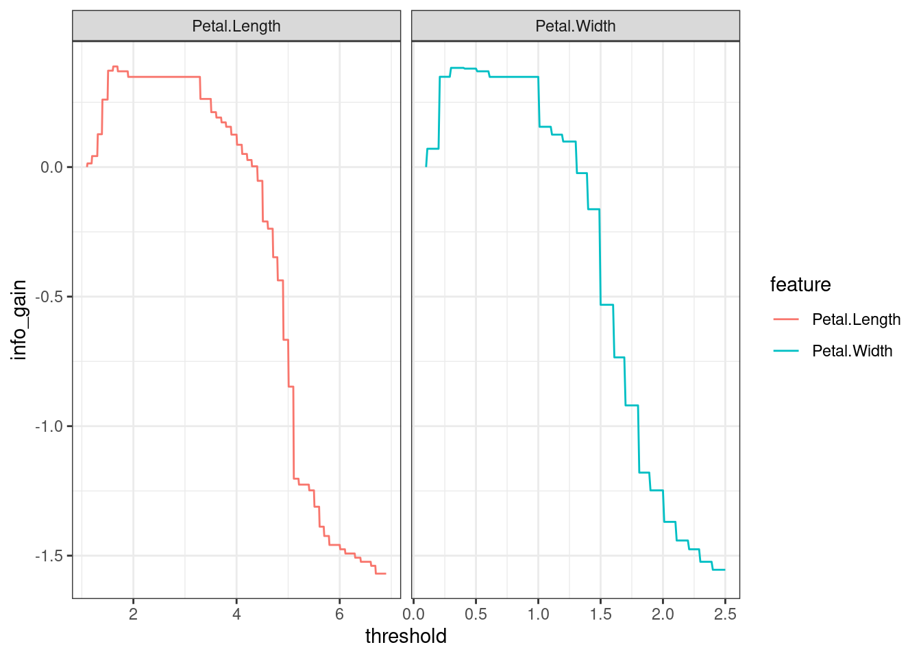
In this case, there’s a tie between the two predictors, both presented the same maximum gain. In petal.length, the maximum gain is also the same along a sub-range of the domain.
df_entropy_gains %>%
    filter(info_gain == max(info_gain)) %>%
    filter(feature == "Petal.Length") %>%
    select(threshold) %>%
    range()
## [1] 1.61 1.69The mean value of this sub-range is exactly the same chosen in the first decision tree (The number which appears on the tree graph is not exactly the same because it is rounded).
(1.91 + 3) / 2## [1] 2.455
3. Repeat steps 1 and 2.
Repeat the spliting process along all the new successives nodes, until the node contains only elements of the same class.
Overfitting and Pruning tree

\[\sum_{m=1}^{|T|}\sum_{x_i\in{S_m}}(y_i - \hat{y}_{R_m})^2 + \alpha|T|\]
After the tree is completly built, the algorithm usually tends to overfit the training data. Following a lot of particularity from the training data, and unlikely these nuances will appear in other data sets.
To prune the tree, a regulator \(\alpha\) is added to the Cost function. This regulator punishes the function as the tree get bigger. The function converges when the information gain from the node spliting doesn’t surpass the punish factor of the growth.
tree_fit_pr <- prune(tree_fit, cp=0.1)

fancyRpartPlot(tree_fit_pr, sub="")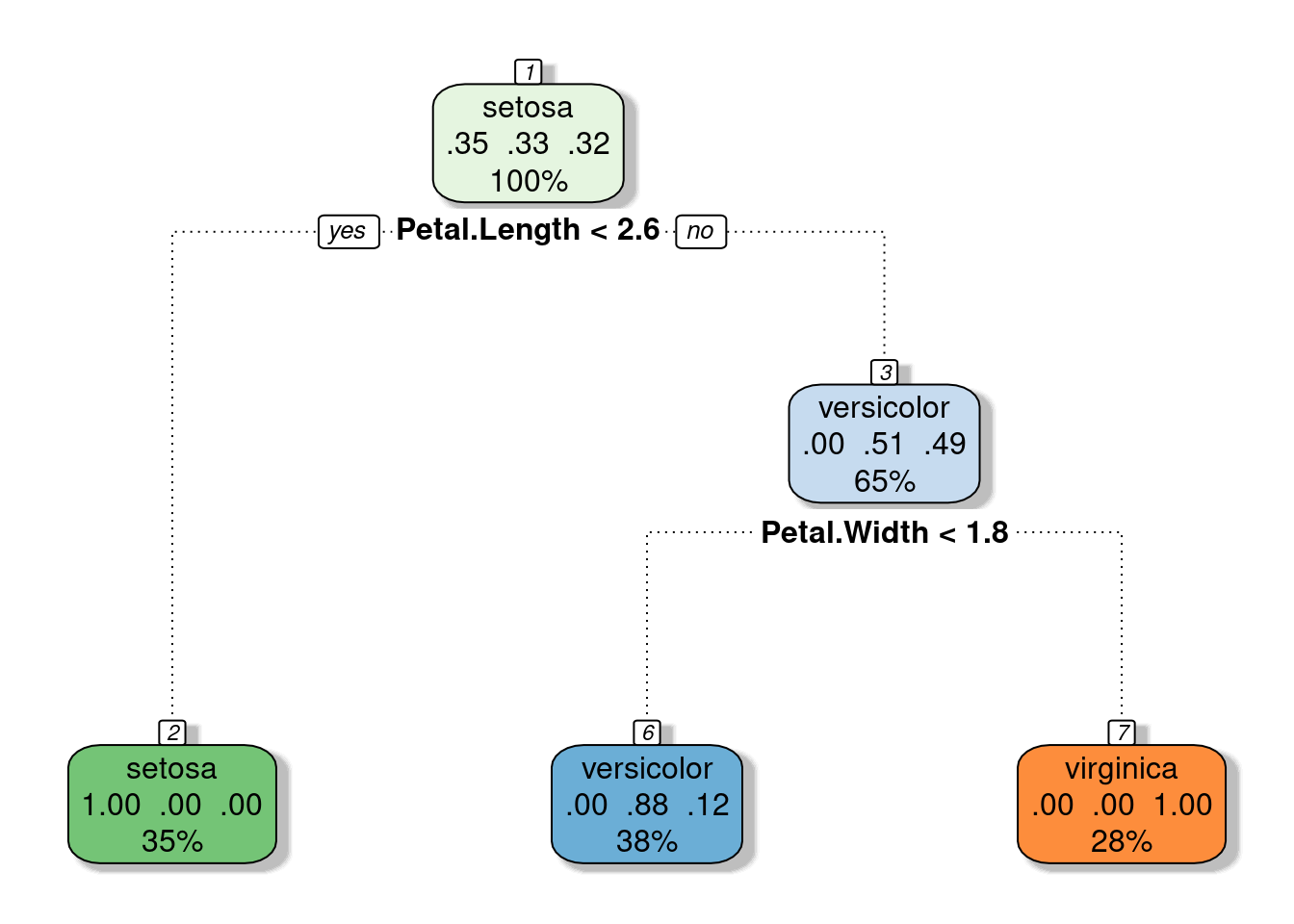
Comparing prediction between the entire and the pruned tree
The two following numbers are the accuracy results in the training set evaluation. The first number shows the result from the entire tree, and the second one, the pruned tree. As expected the performance of the entire tree was better than the pruned tree to training data.
get_accuracy_result <- function(preds, labels) {
    `==`(preds, labels) %>%
        mean() %>%
        `*`(100) %>%
        round(1)
}

train_pred_1 <- predict(tree_fit, train, type="class")
train_pred_1_acc <- get_accuracy_result(train_pred_1, train$Species)

train_pred_2 <- predict(tree_fit_pr, train, type="class")
train_pred_2_acc <- get_accuracy_result(train_pred_2, train$Species)

cat(" Entire tree: ", train_pred_1_acc, "%\n",
    "Pruned tree: ", train_pred_2_acc, "%\n")
## Entire tree: 100 %
## Pruned tree: 95.5 %
Now, on the testing set, the performance of both trees were equals. The pruned tree has a simpler structure, which guarantees a lower variance to the model, a quality that is usually helpful in the prediction of new observations.
test_pred_1 <- predict(tree_fit, test, type="class")
test_pred_1_acc <- get_accuracy_result(test_pred_1, test$Species)

test_pred_2 <- predict(tree_fit_pr, test, type="class")
test_pred_2_acc <- get_accuracy_result(test_pred_2, test$Species)

cat(" Entire tree: ", test_pred_1_acc, "%\n",
    "Pruned tree: ", test_pred_2_acc, "%\n")
## Entire tree: 97.4 %
## Pruned tree: 97.4 %
Ensembling
There are more fancy methods based on decision trees and they are much more powerful.
Bagging
- Based on bootstrap and parallel combination of the trees.
Random Forest
- Based on parallel combination of decorrelated trees, usually hundred.
Boosting
- Serial combination of trees. The next tree is built based on the output of the prior tree.
Considerations of the Decision Trees.
Advantages
- Good interpretability
- It works well for every kind of data
- Insensible to outliers
- Easy to implement
Disadvantages
- It doesn’t perform well for smooth and some linear boundaries.
- It tends to overfit the data, important to prune.
- It isn’t competitive with the best supervised algorithms. Although, using ensembling methods, it can be extreme powerful, but it loses interpretatibility.